.rebranding()
.identity_system()
.stationary()
.publication()
An Unconventional Mark for an Experimental Space
Artechouse, a space dedicated to audiovisual and interactive installations, presents a unique challenge in branding. It required an identity that encapsulates its dual nature: a reputable cultural institution and a haven for experimental art. The hypothetical rebranding process is aimed at creating a flexible identity, one that resonates with the establishment's status yet is adaptable enough to represent the dynamic, avant-garde experiences it hosts. This approach in the Artechouse rebranding reflects a commitment to merging the stable with the cutting-edge, a hallmark of modern design.
↑ MAKING THE MARK
In the redesign of Artechouse's wordmark, a focus on elegance and simplicity set the stage for diverse brand expressions. The letters A, T, and H—signifying 'art', 'tech', and 'house'—uniquely touch the rectangle placed above, subtly highlighting the brand's core elements. This rectangle, with its deliberate 3:5 aspect ratio, symbolizes the integration of the three components in art, technology, and house with the five human senses. This design intricately links the brand's commitment to sensory and experiential art, underscoring its mission in every aspect of the mark.
↓ AND PLAYING WITH IT
The simplicity of the wordmark opens up a playground of creative possibilities, extending beyond graphic variations to physical and dimensional explorations. For instance, business cards feature the rectangle die-cut, transforming it into a keyhole that beckons curiosity. In another iteration, the interaction of the letterhead and envelope invites users to actively form the mark as they pull the letter out, creating an engaging brand experience. The challenge embraced here was to push the boundaries of the mark's application as far as possible while adhering to its foundational rules and system. This approach ensured the brand maintained its cohesive identity while exploring innovative and playful expressions of its visual elements.
↓ FROM AN INTERACTIVE POSTER
By manipulating hierarchy through dimension, the poster for yearly exhibitions encourages viewers to interact and flip, discovering different layers of creativity housed by the brand. This design embodies a playfulness in visual communication, making the poster not just a static display but an experiential journey through Artechouse's identity.
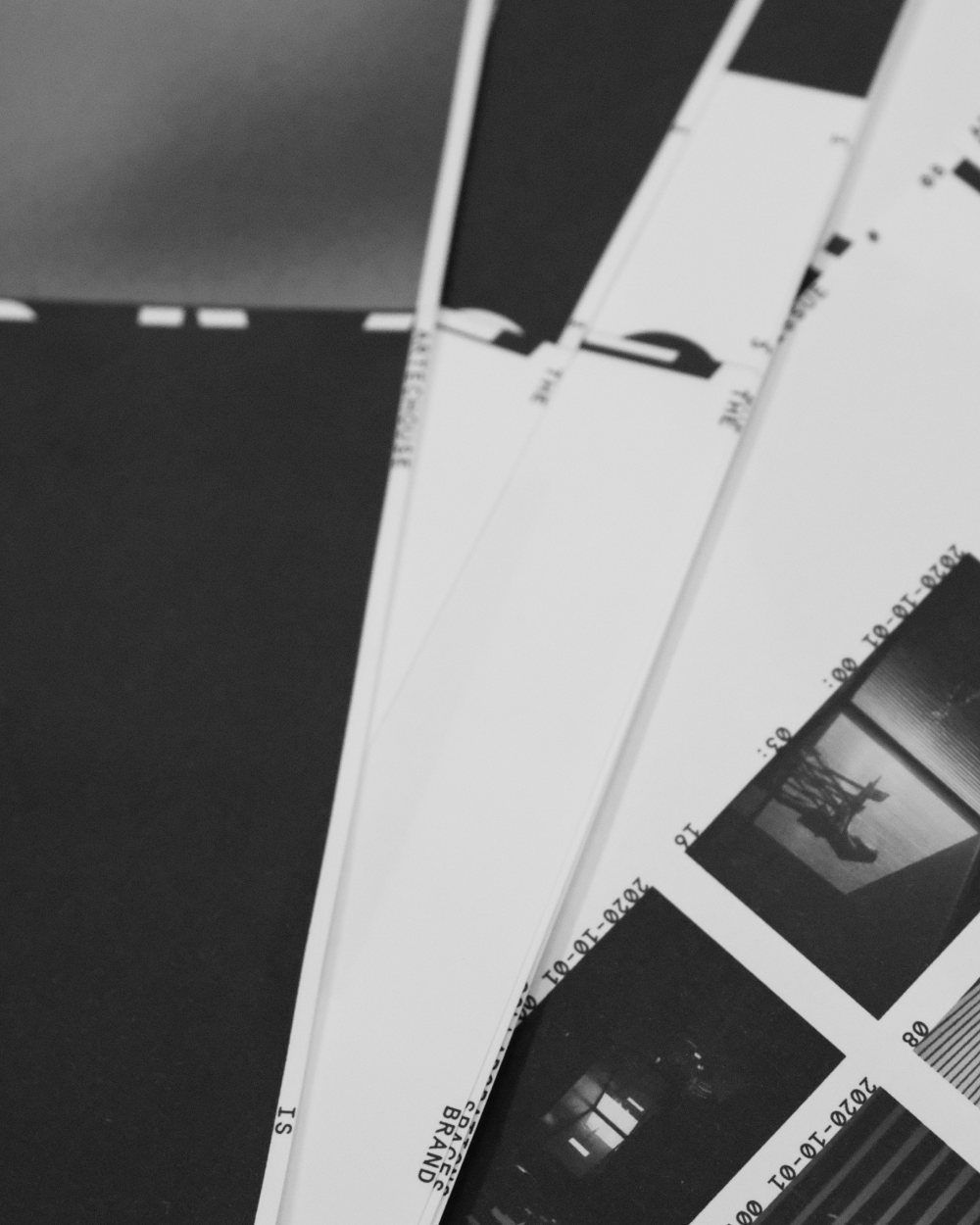
↓ TO AN ANNUAL BETWEEN )( SPACES
The Artechouse annual incorporates the mark physically, running it from the cover to the page edges. This design reveals the full logo when the pages are fanned out, creating a striking visual effect. The book’s grid system, inspired by the mark's frame, adheres to a brutalist approach, utilizing a single typeface and size. This disciplined design choice showcases the vast creative potential that can be unlocked within strict confines—a testament to the thoughtful, rule-based creativity that all artists (as programmers) in Artechouse abide by.